FAQs
How can I analyse data from multiple answer questions?
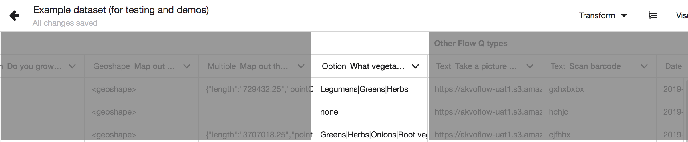
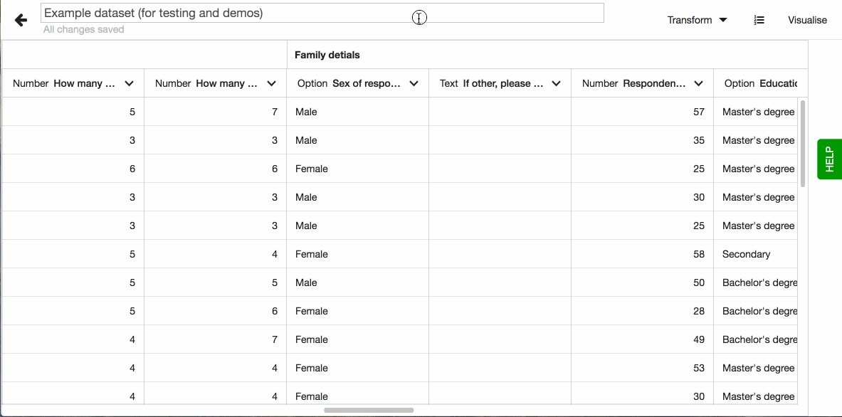
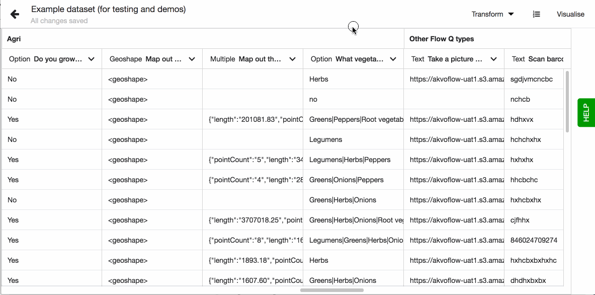
Multiple answer questions allow respondents to choose one or more predefined options. This means that one answer can hold multiple values. In the dataset this type of data usually looks like this in a cell legumes | greens | herbs resulting in this type of visualisations.
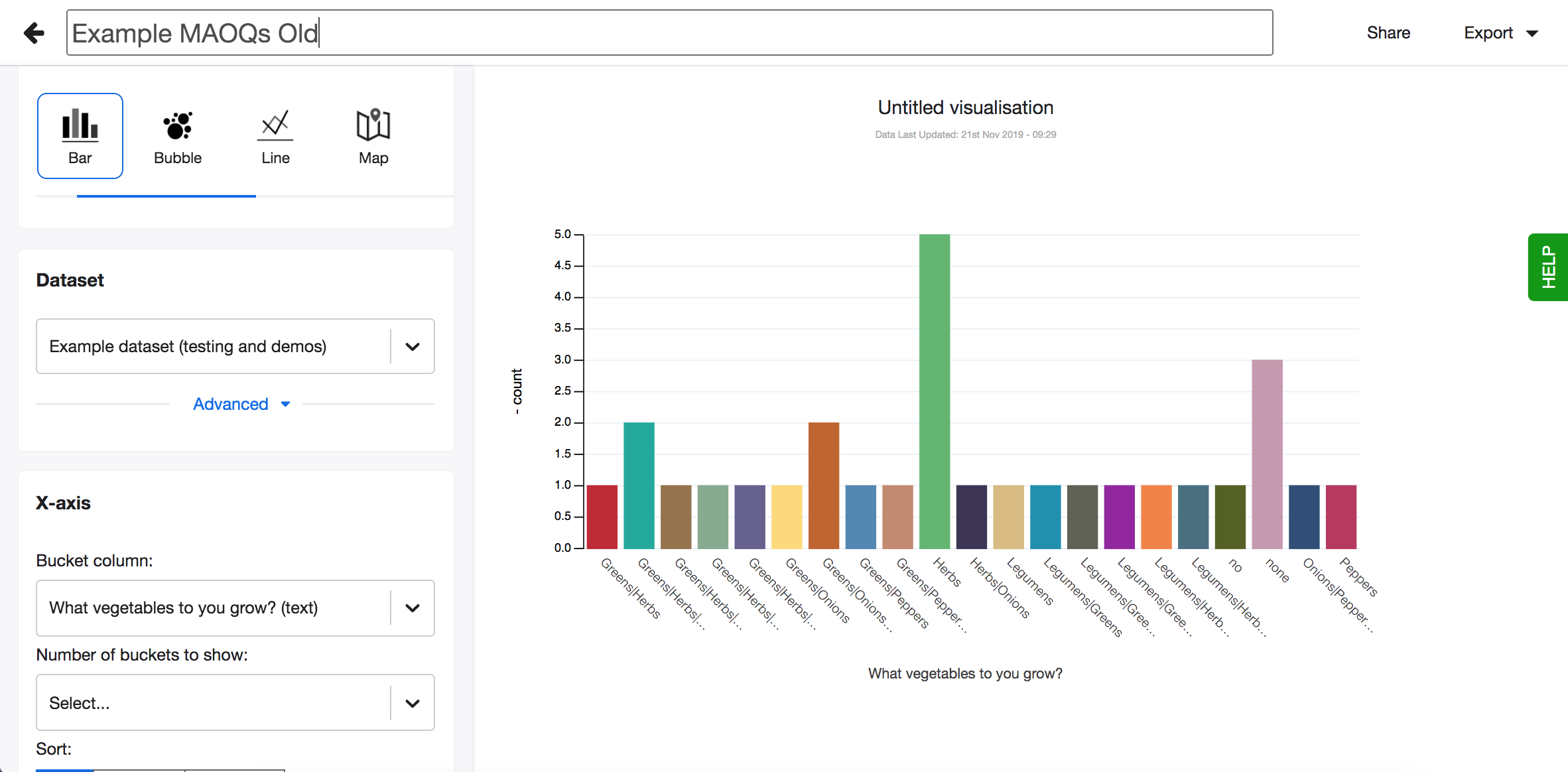
Because every respondent can select different options and any number of options, each cell can hold a different combination of values. Usually when analysing such data you want to know how often each option was selected, which option has been selected the most and how the selected options relate to other data. But due to the nature of this data and how it is shown in the dataset, analysing such data is hard. For example, you cannot use the transformation to split column values, as each column will hold a different option depending on their order.
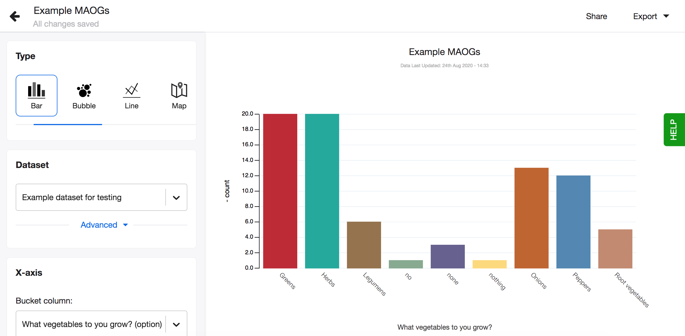
To be able to analyse data from multiple answer questions effortlessly, we introduced the data type - Option.
Data type - Option
The data type - Option is applied on columns from a Akvo Flow dataset, that hold data from option question. It is automatically applied on both single select answer question data and also multiple answer question data. This data type makes it easy to analyse multiple option questions as Lumen automatically groups the options in the variety of graphs and maps you can use for analysis.
Visualising single answer question data
When working with data coming from option questions where only one option can be selected, visualising such data is straightforward, as each cell holds one value. Select the visualisation type you prefer, select the column and each option is defined as a slice or bucket in the visualisation.
If the column holds only two unique values, we suggest using pie or donut charts or a map.
If the column holds more than two unique values we suggest using bar, polar, bubble or scatter charts or a map. For such data pie and donut charts are less suited as it is harder to see the difference in value sizes due to the nature of the visualisation.
Visualising multiple answer question data
With Lumen it is easy to work with data coming from multiple answer questions thanks to Lumen's Option data type. Select the visualisation type you prefer, select the column and each option is defined as a slice or bucket in the visualisation. Lumen takes care of combining the different options. So if you have 5 options the respondent could choose from, Lumen groups all five options and calculates how often the options appear in each row of the dataset. If you select to compare this column with another value, Lumen handles the analysis depending on the aggregation you choose in the visualisation editor. You do not need to transform these columns anymore.
For such data we suggest using bar, polar, bubble or scatter charts. For such data pie and donut charts are less suited as it is harder to see the difference in value sizes due to the nature of the visualisation.
I already have a Flow dataset in Lumen with option data, do I need to import it again?
No. If you already have a Flow dataset in Lumen with data from option questions, you simply need to update the dataset. All visualisations created from these columns will automatically update to reflect the changes. So if you had a bar chart where your x-axis column holds data from a multiple answer option question, once you update the dataset this visualisation will change and each bar will represent one value.
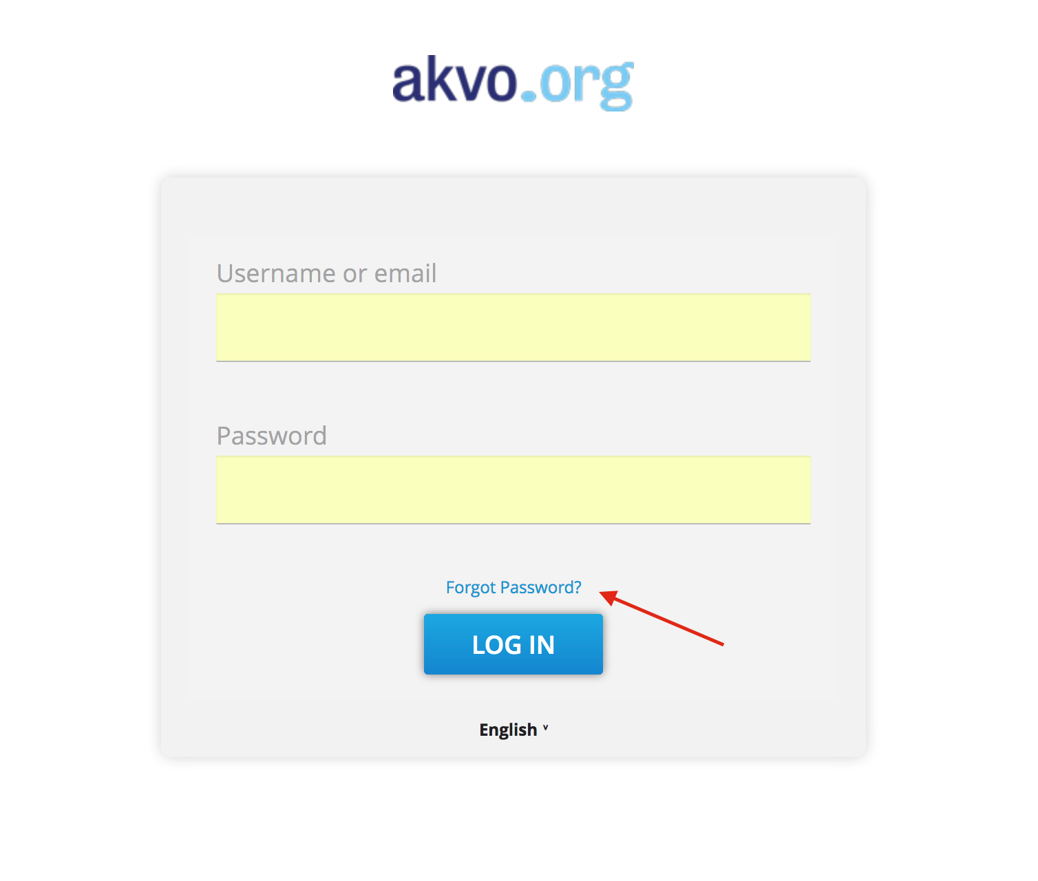
Reset your Lumen password
If you lost or forgot your password to Lumen and have a problem logging in, use reset password option, which you can find next to the log-in button.
You’ll be asked to enter your email address and shortly after submitting it, you’ll receive an email containing a link to reset your password. Please note that, for security reasons, this link expires in 5 minutes.
Why doesn’t the question I want to visualise appear as an option?
Check the data type (number, text or date) of the question you are trying to visualise. Some visualisations (maps, charts using ‘mean’) will only let you use number based questions. Double check your dataset and the data type of the specific question.
What does ‘Varying number of columns’ error mean?
It can happen that while importing a csv file into your instance, an error occurs that says ‘varying number of columns’. In most of the cases, the problem lies in how data in csv file is ‘separated’.
Let’s look at it step-by-step. As you might know, Lumen requires data in csv files to be comma-separated. Each comma in a csv file becomes a break between two columns in a dataset in Lumen. However, it can happen that one or more cells or column titles in your dataset contain a comma as well. For example, a cell value can read:
‘functional, improved’
The comma in this cell introduces confusion to dataset structure. Where the comma is, the cell breaks into two and the structure of the whole dataset changes. As a result you get an error at dataset import.
To prevent this error from appearing, please check if your comma-separated csv file contains commas inside its cells or column titles. If it does – replace it with a different punctuation symbol or remove it altogether. After that is done, try re-importing the csv file into Lumen.
*Note: If your computer is programmed to use commas to differentiate where decimals begin within a value instead of a dot, (for example, when the fraction 25/10 is written as 2,5 rather than 2.5), it is necessary to change your computer’s configuration to use the dot (“.”) instead of a comma (“,”). In order to make this change, please follow the steps outlined below, and then restart your computer. The steps are presented for a 1) Mac system; and then a 2) Windows 8/10 system
- Change decimal comma to Dot in Excel (Mac)
a. Open your “System Preferences” and enter: Language & Region
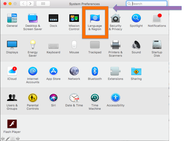
b. Enter: Advanced
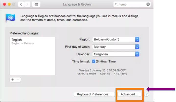
c. Change to the “Number separators” and “Currency” to the following (as demonstrated in the screenshot below): Grouping “,” Decimal “.”
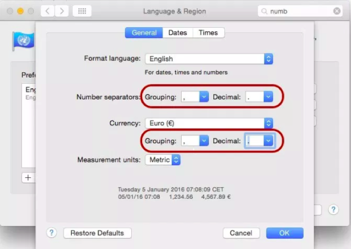
Note: Remember that applications will now interpret numbers using the new settings.
- Change decimal comma to Dot in Excel (Windows 8/10)
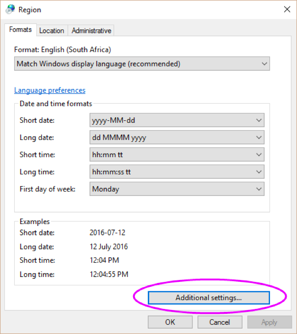
To change regional settings,
- Windows 8: Go to Start > Control Panel > Regional and Language Options |
- Windows 10: (Start > type Control Panel and press enter > Region)
- Click Additional Settings
- For Decimal Symbol, enter a dot: “.”
- For List Separator, enter a comma: ,
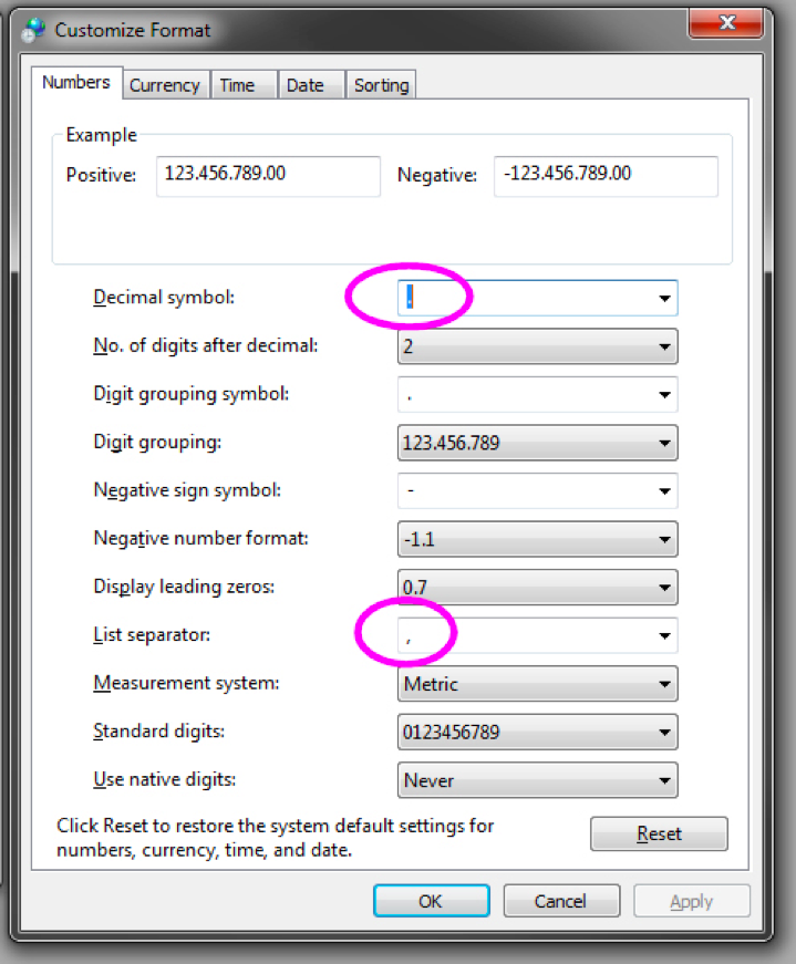
Now, when you open a CSV file in Excel it will automatically find the data fields and open it appropriately. Restart your computer.
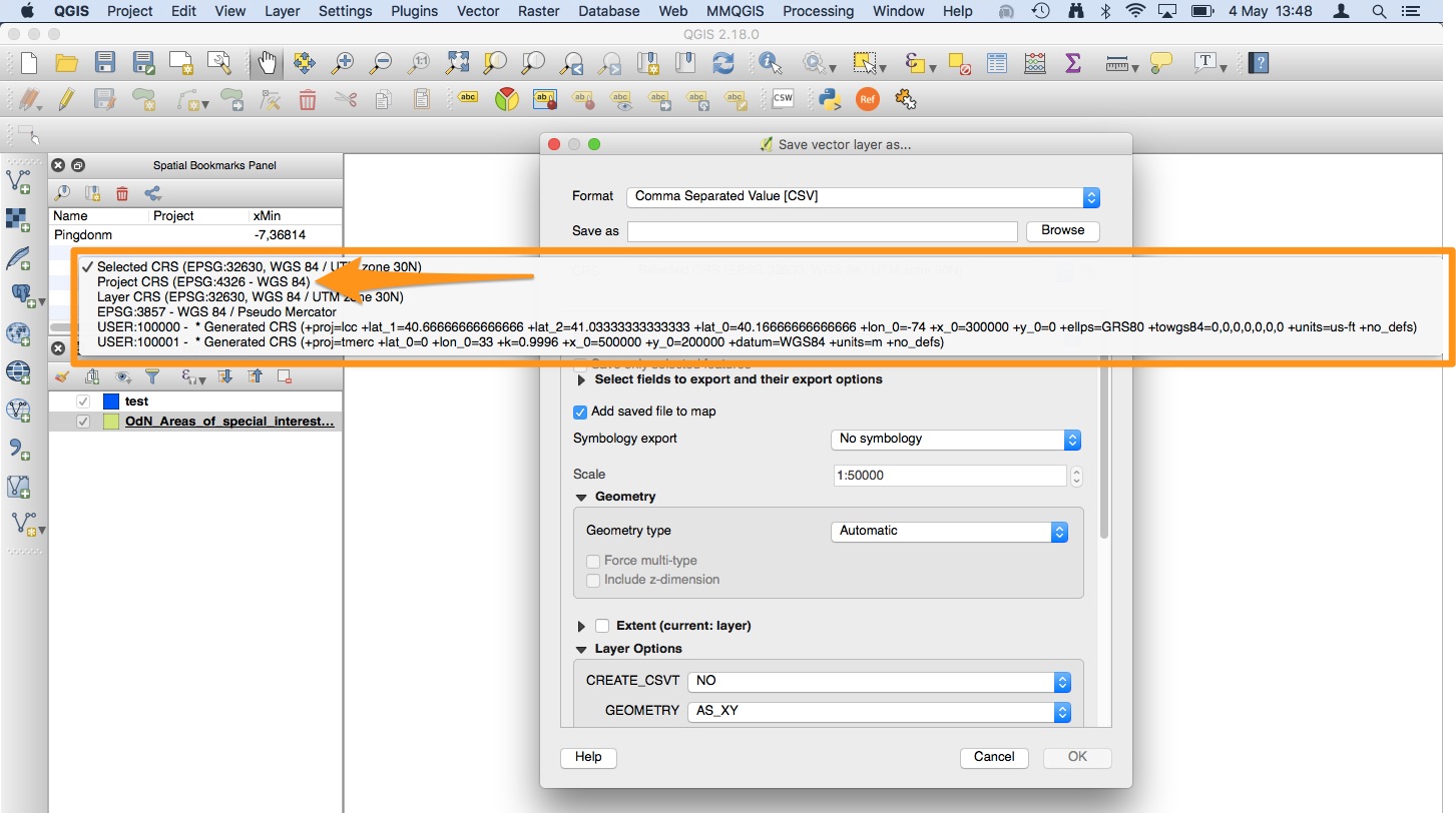
Can I import KML/KMZ files into Lumen?
Yes, however they need to be converted to the Well Known Text format first. Often a KML/KMZ file includes a Z dimension which we need to remove before importing into Lumen. We can use QGIS to perform the conversion.
- Navigate to layer> save as> ESRI Shapefile
- Under Geometry type, choose the type that you are working with. Make sure to deselect "include z-dimension"
- Save the layer
- We will use the ESRI shapefile to convert to a WKT CSV. Again navigate to layer> save as> Comma Separated Value
- Under Layer options> Geometry> Select AS_WKT
- Save the file
My Geoshape dataset imported succesfully however it is not reflected on the map
Lumen processes Geodata with the following coordinate reference system (CRS). Most likely your layer is using a different CRS. When you are converting your layer to WKT CSV, make sure your CRS is set to EPSG:4326. WGS 84 and your shape should be good to go.