Dashboards
Create an interactive Lumen dashboard
Dashboards are a wonderful way to bring together your visualisations to share the insights from your data. Easily design and create online and shareable dashboards. Display your visualisations with context. Share them with a limited audience or the world, via a website, iframe or widget.
Creating a dashboard
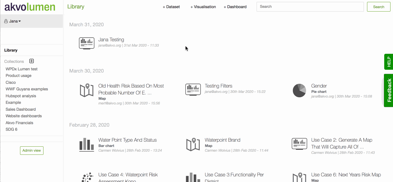
To create a new dashboard, click on the '+ Dashboard' button at the top of your screen. You are now in the dashboard editor. Here you see your dashboard canvas and on the left text elements and visualisations to add.
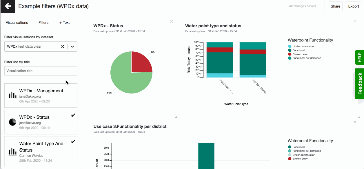
In the dashboard editor on the left, you will see a list of visualisations with the most recently created ones listed at the top. If the visualisation you are looking for is difficult to find, try using the filter – just type in a keyword, for instance ‘school’, and the list will show all matching titles, or search the list based on the dataset you are working with.
Once you found a visualisation you wish to display on your dashboard, click on it and it will instantaneously appear on the dashboard canvas. You can now resize or re-position it so that it fits well with other items you will eventually add to the dashboard. To resize a visualisation, click and drag its bottom right corner until it has the right size. Similarly, click and drag the visualisation to change its location on the dashboard.
Often dashboards are created to share insights from the entire programme or country. But the viewer might be interested only in a subset of the information, like a project, gender or district. To make this possible add filters to your dashboard. Filters are based on the same dataset your visualisations are and allow the viewer to filter out the data she is interested in when viewing your dashboard. For more information, check this article.
Sometimes showing maps and graphs is not enough and you need to explain the visualisations on your dashboard, you want to share some background information about the data, or share insights. You can easily add text elements to your dashboard. At the top of the screen, you’ll find an option to add a new text element to your dashboard. For more information, go to this article.
Viewing a dashboard
To view how your dashboard looks like, go to 'Share' button in the top left corner and click on the shareable link. This link points to your dashboard. You can use it to share your dashboard and preview how it looks like in the browser.
Sharing a dashboard
It is easy to share Lumen dashboards publicly or to a small group of people. You can share your dashboard online using the shareable link, embedding it in your website, or offline by exporting the dashboard. For more information on how to use your dashboards, check the articles here.
Adding text to your dashboard
Sometimes showing maps and graphs is not enough and you need to explain the visualisations on your dashboard, you want to share some background information about the data, or share insights. You can easily add text elements to your dashboard. The text field is added below your last visualisation. Move it around, add more. It is all up to you.
Rich text editor
Make the most out of the text you add to your Lumen dashboard by using our rich text editor. The editor allows you to use the different headers, show emphasis by making your text bold or with italics, and add ordered or unordered lists.

Adding filters to your dashboard
Often dashboards are created to share insights from the entire programme or country. But the viewer might be interested only in a subset of the information, like a project, gender or district. To make this possible add filters to your dashboard. Filters are based on the same dataset your visualisations are and allow the viewer to filter out the data she is interested in when viewing your dashboard.
To add filters select the dataset you want to base your filters on. Make sure you use a dataset that the visualisations use. If your dashboard holds visualisations from more than one dataset, once the filters are applied an '!' will show next to the visualisation for which the filter does not apply. Now you can select the columns you want to use as filters. You can select one or multiple. The columns you can choose from are of the TEXT data type. The filters will automatically be placed on the top of your dashboard. To remove a selected filter, simply click on 'x'.
Using dashboard filters
When viewing your dashboard online you can click on the filter to filter out the data. You can choose to use only one filter or more. If you choose to filter out he visualisations based on more filters, the visualisations will show data for which all filters apply.
For example: I add filters gender, education and village. First I only select gender as the filter and the data female. All my visualisations are now based on data where 'female' is in the gender column. Now I also select from the education filter 'secondary education'. Now all my visualisations are based on data where 'female' is in the gender column and 'secondary education' in the education column.