Charts
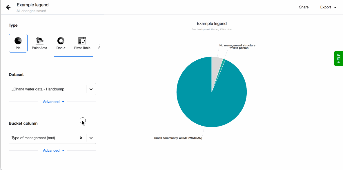
Pie chart
Pie and donut charts are probably the most commonly used charts as they are simple to read. They are great to show relation (proportion) between data, as you compare data ‘slices’ in relation to the whole. The chart is divided into slices and the arc of slice shows the proportional value of each piece of data. Each pie chart slice represents a % and all of them together always equal to 100%.
When making pie or donut charts keep in mind that the more slices, the harder it is to read. If you have more than two slices we recommend to use a bar chart instead.
How to
To create a new visualisation, click on + Visualisation button that you'll see at the top of the screen. You're now in the visualisations editor:
- Choose your visualisation type, in this case 'Pie'.
- Pick the dataset you want to work with using a dropdown in the field 'Dataset'. The dropdown will show a list of datasets uploaded to your instance. If you wish to use a new dataset, you'll need to upload it first (read how to do so in Connect).
- Pick a column in the field 'Bucket column' and it will immediately get visualised as a pie chart.
- Choose to show legend. You can also define the order of the different values in the legend. By default they are sorted alphabetically. To define the order, click on 'Custom' and drag-n-drop the values based on the order you prefer.
- Choose to have values displayed as labels next to each pie chart slice. Note that if a pie slice angle is less than 15 degrees, Lumen will hide the label for better readability. A number and percentage for each pie chart slice will appear on hover.
- Change the colours of the slices simply by clicking on the slice and selecting the colour you want.
- Don't forget to name your visualisation.
Use Dataset Filters when you want to filter out data from your visualisation. For instance, you could filter out all 'Other' survey responses, or choose to focus on data representing one gender only.
All your changes to the graph will be auto-saved by Lumen. Read more about different visualisation types here.
Donut chart
Pie and donut charts are probably the most commonly used charts as they are simple to read. They are great to show relation (proportion) between data. The chart is divided into slices and the arc of slice shows the proportional value of each piece of data.
When making pie or donut charts keep in mind that the more slices, the harder it is to read. If you have more than two slices we recommend to use a bar chart instead.
How to
To create a new visualisation, click on + Visualisation button that you'll see at the top of the screen. You're now in the visualisations editor:
- Choose your visualisation type, in this case 'Donut'.
- Pick the dataset you want to work with using a dropdown in the field 'Dataset'. The dropdown will show a list of datasets uploaded to your instance. If you wish to use a new dataset, you'll need to upload it first (read how to do so in Connect).
- Pick a column in the field 'Bucket column' and it will immediately get visualised as a donut chart.
- Choose to show legend. You can also define the order of the different values in the legend. By default they are sorted alphabetically. To define the order, click on 'Custom' and drag-n-drop the values based on the order you prefer.
- Choose to have values displayed as labels next to each pie chart slice. Note that if a pie slice angle is less than 15 degrees, Lumen will hide the label for better readability. A number and percentage for each pie chart slice will appear on hover.
- Change the colours of the slices simply by clicking on the slice and selecting the colour you want.
- Don't forget to name your visualisation.
Use Dataset Filters when you want to filter out data from your visualisation. For instance, you could filter out all 'Other' survey responses, or choose to focus on data representing one gender only.
All your changes to the graph will be auto-saved by Lumen. Read more about different visualisation types here.
Polar area chart
Polar area charts are similar to pie charts, but each segment has the same angle. What differs is the radius of the segment depending on the value. So the longer the slice the larger the value.
This type of chart is often useful when you want to compare variables, but also show a scale of values for more context.
How to
To create a new visualisation, click on + Visualisation button that you'll see at the top of the screen. You're now in the visualisations editor:
- Choose your visualisation type, in this case 'Polar area'.
- Pick the dataset you want to work with using a dropdown in the field 'Dataset'. The dropdown will show a list of datasets uploaded to your instance. If you wish to use a new dataset, you'll need to upload it first (read how to do so in Connect).
- Pick a column in the field 'Bucket column' and it will immediately get visualised as a polar area chart.
- Choose to show legend. You can also define the order of the different values in the legend. By default they are sorted alphabetically. To define the order, click on 'Custom' and drag-n-drop the values based on the order you prefer.
- Choose to have values displayed as labels next to each slice. A number and percentage for each slice will appear on hover.
- Change the colours of the slices simply by clicking on the slice and selecting the colour you want.
- Don't forget to name your visualisation.
Use Dataset Filters when you want to filter out data from your visualisation. For instance, you could filter out all 'Other' survey responses, or choose to focus on data representing one gender only.
All your changes to the graph will be auto-saved by Lumen. Read more about different visualisation types here.
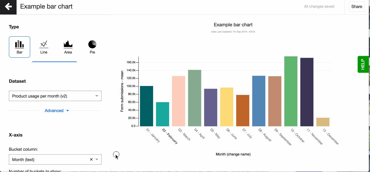
Bar chart
Bar charts are great for comparing values, for instance, total number of functioning water wells across different geographical regions. They provide a way of showing data values represented as vertical or horizontal bars. These charts can be used to compare values or show trend data.
If there is a need to see a composition of something, split or stacked bar charts are ideal for that. It allows you to see, for example, what types of water wells in every region are functioning and how many of them.
How to
To create a new visualisation, click on + Visualisation button that you'll see at the top of the screen. You're now in the visualisations editor:
- Choose your visualisation type, in this case 'Bar'.
- Pick the dataset you want to work with using a dropdown in the field 'Dataset'. The dropdown will show a list of datasets uploaded to your instance. If you wish to use a new dataset, you'll need to upload it first (read how to do so in Connect).
- Pick a column to go on the x-axis (horizontal) that creates the buckets, the bars. You can now see your bar chart, based on the aggregation method - count.
- Pick a column to go on the y-axis (vertical), your metric column. The column you select here can only be of ‘number’ data type. You will see the data type in brackets next to each column name in the dropdown.
- Now change the aggregation type to suit your visualisation. You can for example choose - mean, which means that on the Y-axis you’ll see a mean value for every bucket on the X-axis.
- Change your axis names. By default the column name is shown for both axes. You can change the column name under 'Advanced'.
- Choose to have values displayed as labels above each bar by turning on the setting Show label. A number and percentage for each bar chart slice will appear on hover.
- Change the colours of the slices simply by clicking on the slice and selecting the colour you want.
- You can also define the order of the different values in the legend. By default they are sorted alphabetically. To define the order, click on 'Custom' and drag-n-drop the values based on the order you prefer.
- You can also change the layout of your chart from vertical to horizontal.
- Don't forget to name your visualisation.
Use Dataset Filters when you want to filter out data from your visualisation. For instance, you could filter out all 'Other' survey responses, or choose to focus on data representing one gender only.
All your changes to the graph will be auto-saved by Lumen. Read more about different visualisation types here.
Changing aggregation type
Don’t forget to set the right aggregation type for your metric data in the Y-axis. You can choose to aggregate by: mean, median, max, mean, count, count unique, sum, lower quartile, upper quartile (read more about aggregation types in the glossary). By default, Akvo Lumen will aggregate your data by count.
Automatically the aggregation type is added to the name of your y-axis. You can change this under 'Advanced'.
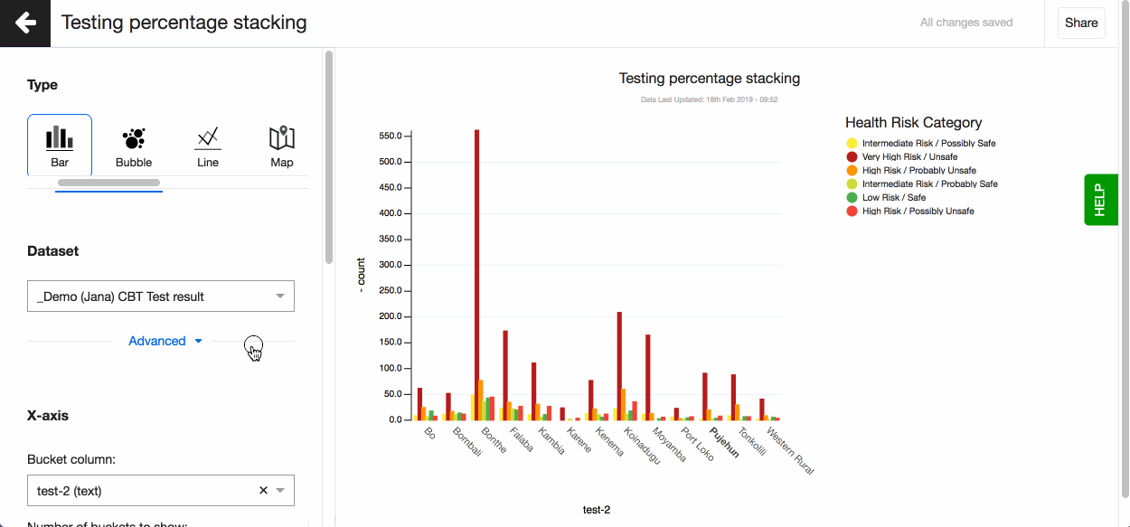
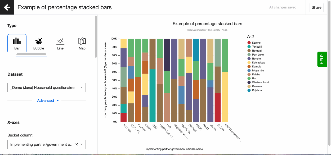
Split and Stacked bars
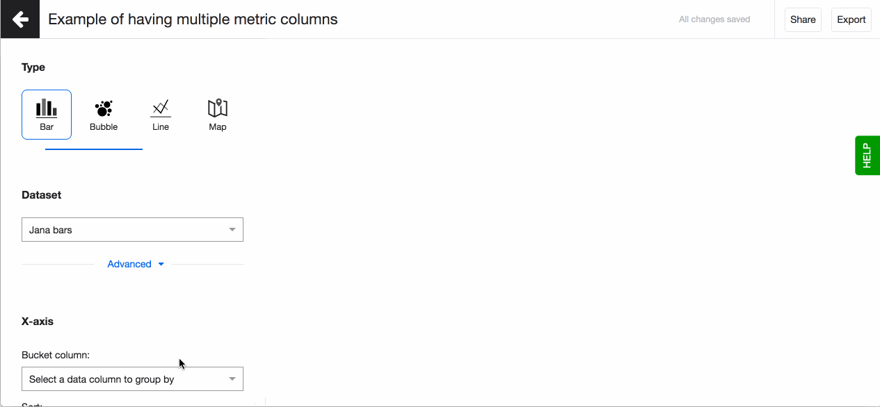
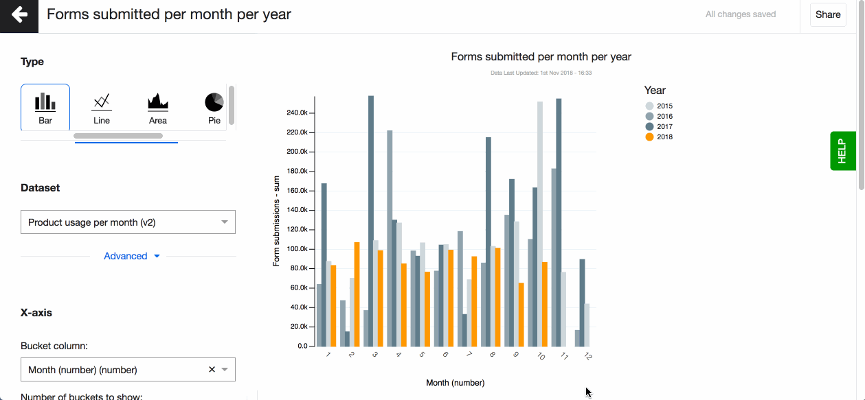
The above steps are enough to create a meaningful bar graph. However, if you wish to enhance your chart with one more layers of data, you can split or stack your columns using either another TEXT column or NUM column.
Split and stack bars using another text column To split or stack your bars using another text variable go ahead and use the ‘Sub-bucket’ field. Choose the text column you want to use and how you want the bars displayed - split, stacked or percentage stacked.
Split bars using multiple number columns
Sometimes you want to visualisation more number columns with your category column in a bar chart, instead of having to create multiple bar charts. For example, if you want to show the type of activities you did in your project and the number of men and women who attended. Or if you have data on different crops farmers grow and their yield and income.
To do so, after selecting your category column (TEXT) on the x-axis, go to the y-axis and select one on more metric columns (NUM). Make sure to change the aggregation type. Your bars will be automatically split.
Horizontal bars
After setting your x and y awes, you can also edit another setting for bar charts - Horizontal. By turning it on your columns rotate horizontally. The benefits of this layout are:
- Better readability of long labels
- Better display if you have more categories to display
Bubble chart
Bubble chart, similarly to bar charts, are handy to showcase the distribution of values. They provide a way of showing data values represented as bubbles and give you an alternative to the well known bar charts. The size of each bubble depends on the metric column you select. They are especially handy if you have many values to show.
How to
To create a new visualisation, click on + Visualisation button that you'll see at the top of the screen. You're now in the visualisations editor:
- Choose your visualisation type, in this case 'Bubble'.
- Pick the dataset you want to work with using a dropdown in the field 'Dataset'. The dropdown will show a list of datasets uploaded to your instance. If you wish to use a new dataset, you'll need to upload it first (read how to do so in Connect).
- Pick a column that creates the buckets, the bubbles. You can now see your chart, based on the aggregation method - count.
- Pick your metric column. The column you select here can only be of ‘number’ data type. You will see the data type in brackets next to each column name in the dropdown.
- Now change the aggregation type to suit your visualisation. You can for example choose - mean, which means that the size of the bubbles depends on the average value for every bucket.
- Choose to have values displayed as labels in each bubble by turning on the setting Show label. A number and percentage for each bubble will appear on hover.
- Change the colours of the bubbles simply by clicking on the slice and selecting the colour you want.
- Choose to show legend. You can also define the order of the different values in the legend. By default they are sorted alphabetically. To define the order, click on 'Custom' and drag-n-drop the values based on the order you prefer.
- Don't forget to name your visualisation.
Use Dataset Filters when you want to filter out data from your visualisation. For instance, you could filter out all 'Other' survey responses, or choose to focus on data representing one gender only.
All your changes to the graph will be auto-saved by Lumen. Read more about different visualisation types here.
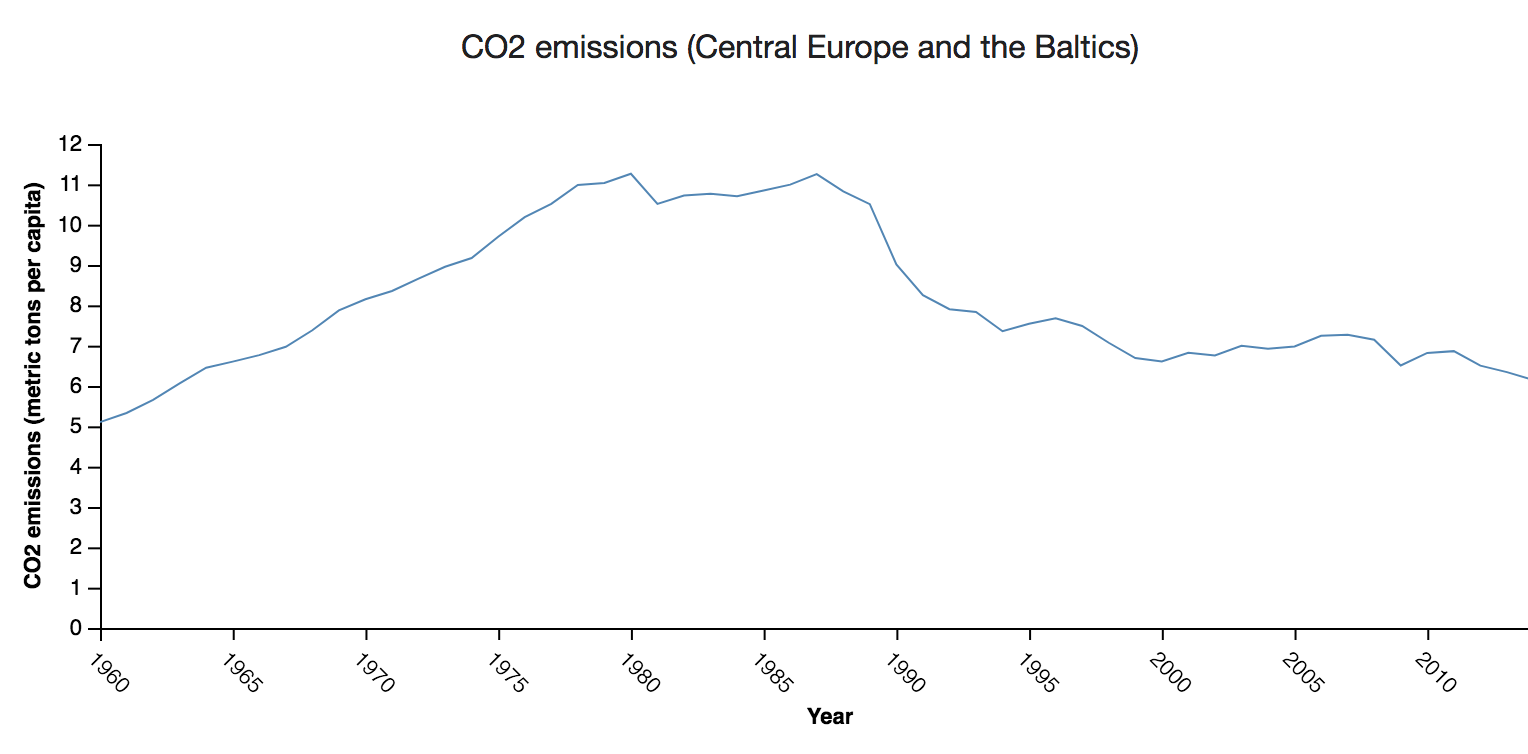
Line chart
Do you want to compare values, especially in time series? A line chart is a way of plotting data points on a line. Often, it is used to show trend data, change of values over time, or to compare data variable.
How to
To create a new visualisation, click on + Visualisation button that you'll see at the top of the screen. A choice of different visualisation types will open up, from which you should choose 'Line'.
You're now in the visualisations editor. Here you can pick a dataset using a dropdown in the field 'Source dataset'. The dropdown will show a list of datasets uploaded to your instance. If you wish to use a new dataset, you'll need to upload it first read how to upload a Flow dataset or a data file.
Pick a column containing numeric values that should go onto the Y axis. Axis label will be defaulted to the title of the column that you've chosen from the dropdown, but feel free to change it. Now go ahead and pick a column to be displayed on the X axis. X axis label can be customized as well.
Aggregation method available for line charts is similar across other visualization types in Lumen – choose to aggregate your data on mean, median, max, min, count, count unique, sum, lower quartile and upper quartile.
Use Datest Filters when you want to filter out data from your visualisaiton. For instance, you could filter out all 'Other' survey responses, or choose to focus on data representing one gender only.
Lumen will autosave all the changes you've made.
Lear more about different visualisation types here.
Scatter plot
Scatter plots are great for understanding relationships between different variables and visualising distribution of your data. For instance, you will be able to check if there is any relationship between the number of people using a hand-wash facility and its functionality status. Scatter plots work best for identifying outliers in your data as well. By outliers we mean data points that stand out from a group of other data points that have more or less similar qualities.
A scatter plot is used to display three dimensions of data at the same time. The location of the bubble is determined by the first two dimensions and the corresponding horizontal and vertical axes. The third dimension is represented by the size of the individual bubbles. With Lumen, you can add a fourth dimension by selecting the variable that defines the colour of each bubble.
How to
To create a new visualisation, click on + Visualisation button that you'll see at the top of the screen. You're now in the visualisations editor:
- Choose your visualisation type, in this case 'Scatter plot'.
- Pick the dataset you want to work with using a dropdown in the field 'Dataset'. The dropdown will show a list of datasets uploaded to your instance. If you wish to use a new dataset, you'll need to upload it first (read how to do so in Connect).
- Pick a column to go on the y and x-axis. Please note you can only use number and date data here.
- Change your axis names. By default the column name is shown for both axes. You can change the column name under 'Advanced'.
- Add a 3rd variable. Select a column for Size.
- Colour code the bubbles based on a value in Category.
- Change the colours of the bubbles simply by clicking on the bubble and selecting the colour you want.
- You can also define the order of the different values in the legend. By default they are sorted alphabetically. To define the order, click on 'Custom' and drag-n-drop the values based on the order you prefer.
- Don't forget to name your visualisation.
Use Dataset Filters when you want to filter out data from your visualisation. For instance, you could filter out all 'Other' survey responses, or choose to focus on data representing one gender only.
In the ‘Aggregation’ set of fields, you’ll see fields 'Bucket column' and 'Aggregation type'. Bucket column option allows you to aggregate data points on a specific column from your dataset. It's especially handy to use when you wish 'to cluster' your points by geographic region. For example, you could cluster points by county, instead of having all individual data points appear on the plot.
Aggregation types are similar to all the other visualisation types available in Lumen – choose to aggregate your data on mean, median, max, min, count, count unique, sum, lower quartile and upper quartile.
All your changes to the graph will be auto-saved by Lumen. Read more about different visualisation types here.

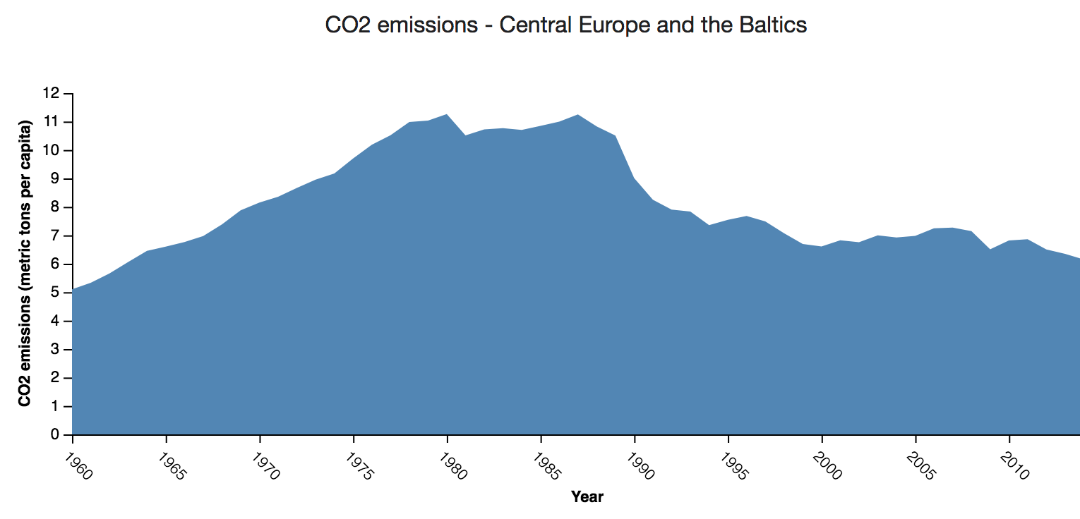
Area chart
An area chart, like a line chart, is a way of plotting data points on an area. Often, it is used to show trend data, change of values over time, or to compare data variable.
How to
To create a new visualisation, click on + Visualisation button that you'll see at the top of the screen. A choice of different visualisation types will open up, from which you should choose 'Area'.
You're now in the visualisations editor. Here you can pick a dataset using a dropdown in the field 'Source dataset'. The dropdown will show a list of datasets uploaded to your instance. If you wish to use a new dataset, you'll need to upload it first (read how to upload a Flow dataset or a data file).
Pick a column containing numeric values that should go onto the Y axis. Axis label will be defaulted to the title of the column that you've chosen from the dropdown, but feel free to change it. Now go ahead and pick a column to be displayed on the X axis. X axis label can be customized as well.
Aggregation method available for area charts is similar across other visualization types in Lumen – choose to aggregate your data on mean, median, max, min, count, count unique, sum, lower quartile and upper quartile.
Use Datest Filters when you want to filter out data from your visualisaiton. For instance, you could filter out all 'Other' survey responses, or choose to focus on data representing one gender only.
Lumen will autosave all the changes you've made.
Lear more about different visualisation types here.
Visualisation colours and legend
The mail goal of any data visualisation is to convey insights from the data. Besides setting up the visualisation, choosing your variables and picking the right visualisation type what also helps to tell the story the best are the colours you choose for your visualisation and the description you add to it.
Colours
Lumen by default colours the buckets of your visualisation. But sometimes having 'Yes' shown in red and 'No' in green can be confusing to the person viewing the visualisation. Or perhaps you want to ensure the visualisation matches your organisational brand as you are sharing it on your website.
It is easy to change the colours of a visualisation on Lumen. Simply click on the part of visualisation you want to change and select the colour from the colour picker.
Legend
When arranging your visualisations into a dashboard or sharing them on your webpage you sometimes want to adjust the position of the legend. By default having it on the right hand side might not fit the layout you selected the best. Decide where to show the visualisation's legend by choosing from the four possible options, right, left, top and bottom.
You can also define the order of the different values in the legend. By default they are sorted alphabetically. To define the order, click on 'Custom' and drag-n-drop the values based on the order you prefer.